Warhol
Last night i got a late call from Steve Banks (6:30pm) at PSS asking me to do a flier for a do him and his work colleagues are having this week. He sent me this .jpeg and said:
"hi dan
please can ya ammend the image to say.........
banksy & craig always say,
.......then the rest of it.......
and put it in the top left corner.
then underneath and in the bottom left corner put.......
join us for after work drinks at
Norman Bar, Call Lane, 6pm - 10pm
£2 on selected drinks
thanks
steve"
and this was the image he sent:

Now, as any one will know, you can't take a crappy jpeg, delete stuff, add text and alter bits without making a mess. I told Steve this and said the only way to do it would be to take a different photo, edit it to look like that one, then add the text. "Yeah great, thanks" he said.
"Oh and can i have it by tonight".
So i did. Here's the process:


Took me about an hour and i had to leave my beans and sausages on toast till later to get it done but i did it.
And i got it in one.
Papa Boome
Got a call from Papa Boome aka. Señor Boome aka. Boome Snr. and he offered me some work, which is nice considering he's an old school joiner and hasn't offered me work since I gutted That Attic for him That One Time. Well it's not really work for him per se, but to cut a very long story and 45 min phone call short, a family friend collates, produces and distributes a small publication of local tradesmen, skilled labourers and local businesses. Think of it as a kind of local mini-yellow pages. Anyway it's into it's 6th edition now, and during a conversation with said family friend Old Papa mentioned I was a designer and would be happy to help out with layout etc.
So I've got a couple of old editions (see below) and hopefully should be working on the next one.
And getting paid. Happy days.
Sent from my iPhone
Mobile Awesomness
So I just set up Mobile Blogging - now all i have to do when i want to post something is email it to a certain address and BOOM! (or Boome) and voila, it's on this blog.
Cool huh...
Cool huh...
New Website
I'm starting a new website to replace the old one. Why i hear you ask? Well, let me tell you.
For one, I never actually finished it. There's no explainations, no descriptions of work, the navigation was awkward and to be honest it was a little messy. I think i got it to a point where I'd really had enough, and it worked enough to go live so, as a test, I put it up and it worked! But just working doesn't make a good website. So for one, it needs finishing.
Secondly, I don't like the design anymore. It was kind of a concept and experiment at the time, and again, it worked, but it's not amazing. It needs to be clearer, easier to use and cleaner. But it was nice while it lasted.
Lastly, and probably more tellingly, I did it relatively quickly and got bored of it very quickly. I do that. I get fed up with my work and want to do something else. Constant change and all that. So i want something that can last, something that I've put a lot of work into making, so I'm gonna take my time with this one.
I think...


10 Brief Subjects...
Right, done. After writing up the briefs, here's the final 10:
Low Clothing
PSS Greetings Cards
M. Boome Joinery Services
E4 Monday Night Movies
Metro
Don't Panic!
Guilty Pleasures
NFL/NBA 2010-11
Xbox vs PlayStation
Lost
Low Clothing
PSS Greetings Cards
M. Boome Joinery Services
E4 Monday Night Movies
Metro
Don't Panic!
Guilty Pleasures
NFL/NBA 2010-11
Xbox vs PlayStation
Lost
Negotiated Briefs
The biggest problem I have when it comes to writing and researching my own briefs lies with the fact that I'm still not 100% sure what areas of graphic design I want to fully pursue. For example, I'd really like to try some layout and editorial design, but having not really explored that side of design yet would it be right for me to go into it now, in my 3rd year, when maybe i should be focussing on something I've tried and tested before. Similarily with motion graphics, which I've only really dabbled in before, and branding and identity which I've done practically nothing with before. But I don't want to have a stack of briefs that all say "produce a poster", "design a book cover" etc etc, just because that's what I'm used to. So it's a tough cookie.
Website
So this website has taken me literally all these past 2 weeks to do, and then a whole day and half figuring how to get the damn thing on the internet, but it's done! hopefully the "LIVE" button will be pushed soon!
Image Editing
SO that was one MAMMOTH beast of a job editing all those damned images and i hop i never see them again. It took me SO DAMN LONG i'm seriously not impressed with it. So here are the finished pages, sack sticking each individual image up here.
It starts with a main work page, with square links to each subsequent piece of work's page...

And then these are the individual pages:


It starts with a main work page, with square links to each subsequent piece of work's page...

And then these are the individual pages:


Work Concept
Now obviously i have to get my work online. going along with the whole sketch-book idea i want to try and get a ripped edge look to the images. I'm gonna have small preview squares of each image that will then expand out into full sized images.
The process will go thus:
- scan in torn pages
- adjust them to the right ratio of the sections they'll fill in dreamweaver
- delete the background
- copy the edge template
- paste on top of edited image of work
- inverse select and delete un-needed section
- make sure image size is right ratio
- save as .png so deleted background stays clear
That should then leave each image in the right format and scale to be inserted into the Dw template. Then i'll need to import all the original images into lightbox and with each edited image make a link between it and the original.
Easy as that...i think...


Website Progress - Page 1
So i decided t go with the BOOM in your face idea, and so i did this awesome roll-over image and link. Gonna roll a similar thing across all the pages.


So this is my final first page:


So this is my final first page:


First Page
After many tries and tests and experimetns with the size of the icons, this is my new first page. It lacks a bit of ooomph, and i think if i'm gonna keep this i either need to take away the writing or make it bolder, cos it just doesn't have any impact. It needs to be in your face or subtle with just the icons.


Website Concept
I have an overall concept at the moment for my website. A lot of websites i'm looking at at the moment of designers all seem to be the same - generally blank, white backgrounds with small black text and logos. Now i'm not saying they don't look good. They do. And i guess its so it doesn't take anything away from the work. But it's just a bit generic. So i think i'm going to try and do something a little different. It probably won't work and i'll probably make a mess of it but hey-ho, if you don't try and all that.
This is Me&My Pen, the very talented illustrator and designer Darren Newman. His website is a classic example of this, and it looks smashing. But there's LOADS just like it (though not executed quite as well as this)

So I'm going for a sketch-pad-esque look, with written writing and trying to continue the work on icons i did last year with icons for the tabs/links instead of words.
we'll see how it goes...
MY MUM
Just been asked today - by my mum - to do some logo and identity work for....my dad ha. He's a self-employed joiner and with the old recession work has dropped off somewhat of late so, as my dad can't even turn a computer on, they've asked me to design some business cards, letter-headed paper, compliment slips, local paper advertisements and some form of website. That's the first week of my summer gone then...
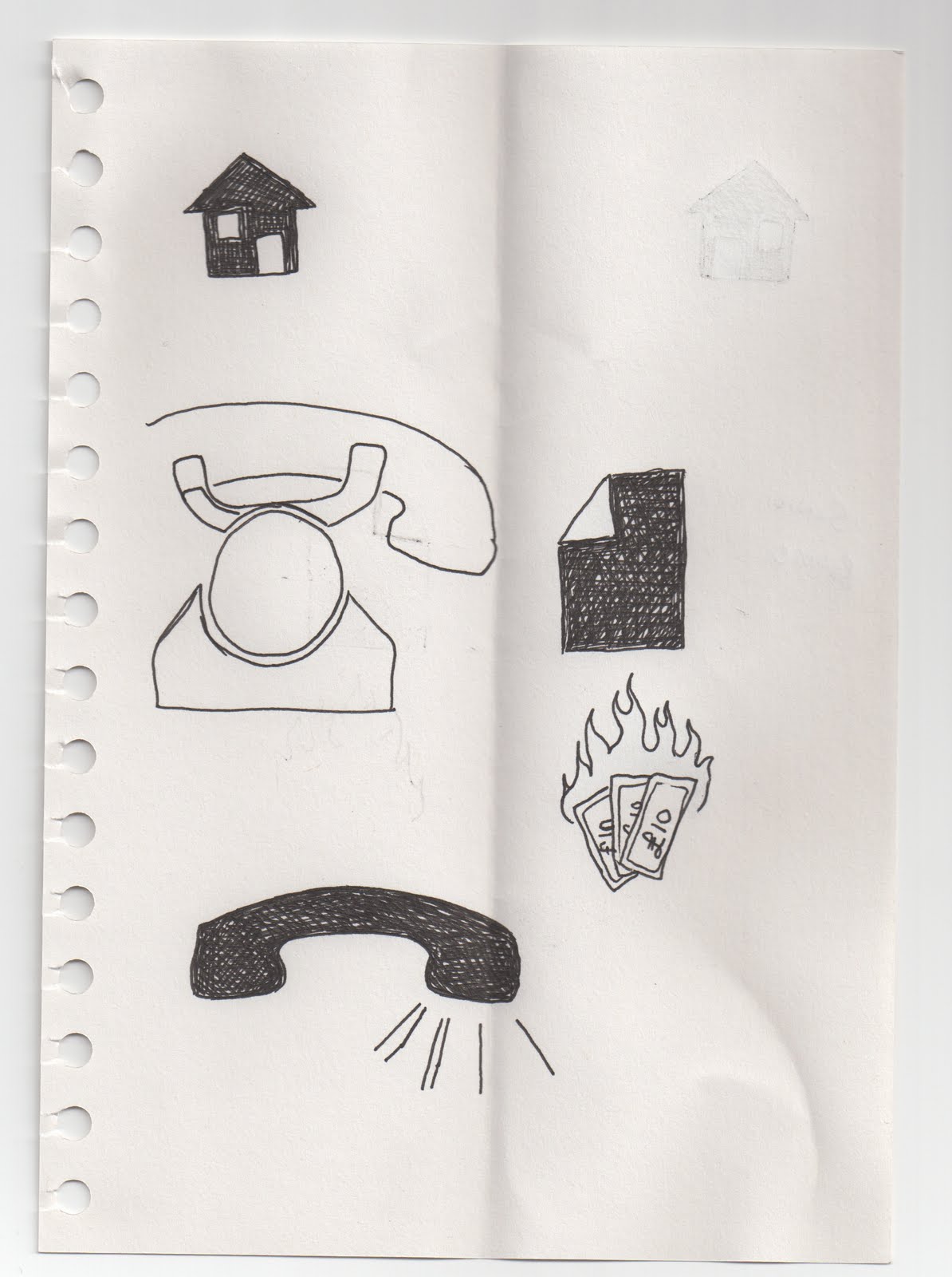
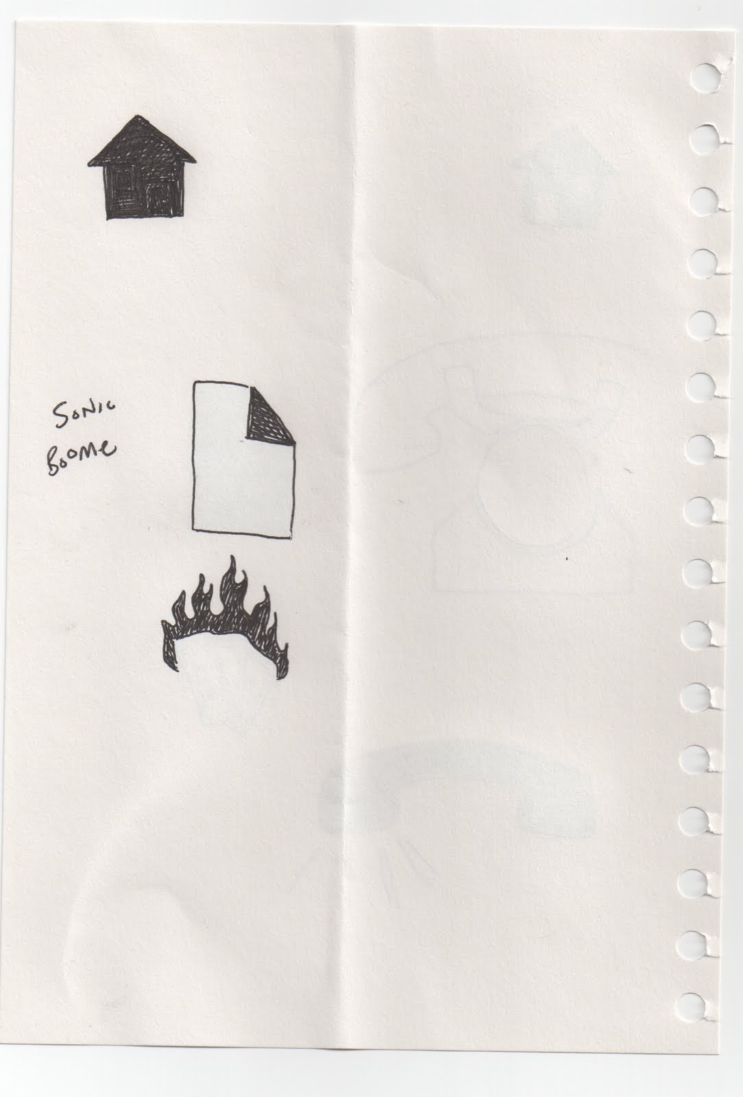
NEW IDEA FOR PERSONAL IDENTITY
Not been too pleased with, or thought much about, my personal identity for my website and other materials. Then I drew this (see below). Now I'm a pretty simple kind of guy, and pretty easy going so I thought this was actually quite fitting to my personality. Plus i've always wanted to call my first son Sonic (it's gonna happen!!). I think the hidden reference is rather obvious, and its has quite a ring to it, and besides I've already bought the domain name. So it's a done deal.
OUGD203 - DESIGN PRACTICE 2 EVALUATION
For me, this module has been an extremely successful one. With our PPD presentations coming up, a lot of what I've learned about myself and my practice has come in this last module. First of all, the collaborative project I think worked out very well. Our partnership was based on mutual respect for each other and each others individual skill set, and we worked very well and very hard together. In both this and the product/range/distribution briefs I feel I produced very high-quality end products and design, and this is where this module has differed to modules past (especially in the first year). I had a habit of making lots of ambitious plans and never leaving myself enough time/planning time effectively/putting in the effort to get a final product finished, and then some. In both projects in this module I have planned to have a final product done and finished with a week left till deadline (both being 5 week briefs) leaving me enough time to make any adjustments or still be able to get everything done should anything go wrong. This has meant not only have I been able to finish, but to a standard I'm happy with.
I gave myself the opportunity to try out different print processes this module, with varying degrees of success but overall its come out exactly how i wanted. Screen printing is a process I've used before and enjoyed immensely, so i was more than happy to use it again, and the results were very satisfying. Using a similar process I got the chance to also spot varnish, print on t-shirts and flock, all of which I'm convinced I'll be using again. The spot varnish i had a little trouble with, probably because i used the wrong type of screen (fabric instead of paper) and the flocking was really only tested - I'm going to try and do some larger more experimental testing with it soon, the same going for t-shirt printing. I also was able to make use of the digital print room and test stock and colour for the collaborative brief.
The majority of the module has played out like most of my longer-term projects have - a week of research and ideas, 2 weeks of faffing about not getting anywhere (that's not to say I didn't work - just not a lot of it was useful), then 2 weeks hardcore crazy work to get done in time. My general planning of tasks has been much better though, and I've set myself goals and dates to achieve them, and generally stuck to them. The usual stubborn one-idea-mode featured prominently in the second project, but once I knocked that out of the park and started to just do work rather than over thinking in then the results started to show. I have tended to get too bogged down on one idea and with one direction too early, run out of steam and lose my way in the middle. The biggest boost was when I had my tutorial with Fred and he told me to look at work I'd already done, stuff I wanted to emulate and go from there rather than a blank piece of paper. This needs to be my approach to work from now on, and not get stuck on blank-white-paper syndrome. In the collaborative project it wasn't so much of a problem because as soon as one of the partnership had an idea or started working on something the other would then come in and work out how to take it forward further.
Something I learned from my image module that I definately applied to the work I produced was to take an idea or concept, work it out a little, and then go for it. With my book cover designs, I could've spent an age drawing sketches and moving this around and adding this etc but when I stopped and just started producing stuff is when the best results came about. They could then be worked on further, but the premise of just getting stuff made was the same. I've not made any secret about the fact that I don't like long briefs, and I much prefer the short sharp get-it-done projects, and I've had to break myself out of treating the longer briefs as long briefs and start treating them like lots of mini-briefs to make the workload more manageable and to motivate myself.
There were quite a few product ranges I would've liked to have done but didn't have time to finish such as packaging and point of sale for t-shirts, bookmarks, a single purpose website and other t-shirt designs (both design and make). Some of these I think I may continue over the next couple of weeks anyways, particularily the t-shirts, just for the sake of it really. Which is another thing this module has taught me, which is to enjoy the work I do to a point where I want to continue it even in my spare time, which isn't where i was at before. Alot of the work I'd do was more because I had to do it as opposed to a desire to do it, but I think that's started to change now.
How would you grade yourself on the following areas(5= excellent, 4 = very good, 3 = good, 2 = average, 1 = poor)
Attendance: 5
Punctuality: 5
Motivation: 3
Commitment: 3
Quantity of work produced: 4
Quality of work produced: 4
Contribution to the group: 4
RYAN GREGSON
I was screen printing some t-shirts the other day, when I met this guy, Ryan. He was screen printing some t-shirts as well with his own brand No Brakes Fixed Gears. He had some pretty sweet and rather complex screen prints going on, and to cut a long story short I bought 2 of his t-shirts. The wife wasn't happy but they were cool so I was. He gave me his business card with a view to collaborating at some point too so overall it was a success.
Open publication - Free publishing
ART REPUBLIC - SAM RHODES
The wife and I went to london this weekend and amongst the many awesome and fantastical museums and galleries we went to one of which was ArtRepublic Soho, a small contemporary art and screen print gallery and shop which sells prints from artists such as Damien Hirst, Banksy and others. Their website has quite an extensive selection artists works and prints for sale, and we bought one from an artist called Graham Carter, which came in a bespoke frame painted to match the print. This is the print we bought, entitled Cloud Catcher

And this is his website with links to where you can buy his prints. He mostly does illustrative type work which is then screen printed.

Now when we were in there we had a good long chat to the gallery manager, Sam, and talked about the work they sell and how to get work in there, and he said if I wanted to sell my prints with them I could, to just email him, send him a copy, and if it fits in with the stuff the sell then they'd sell it! Which I must say i was quite surprised, but rather happy, with. Good times!
Open publication - Free publishing
OUGD204 - IMAGE MODULE EVALUATION
This module has been quite a nice surprise for me, in terms of the briefs set and also my own responses to those briefs. I have been able to explore a more personal approach to my work than i feel i have been able to in other modules and briefs, and uncover a number of skills I have yet to develop in other areas. One of those is photography, of which i am by no means a master, but i have enjoyed the processes of finding suitable locations and subjects and being able to manipulate these into a final outcome. I've also been able to attempt some more illustration based work which i've really enjoyed. I think the main factor behind this have been more open briefs which, while unrealistic in a professional work environment, has made me want to put more time and effort into personal projects that i can develop my various skills, which can then influence my working practice.
Another factor has been the issue of time - obviously with limited 3 hour sessions, week long deadlines, and running concordantly with other modules, for me, there has been a greater emphasis on thrashing out ideas quicker and more exactly than on some other, longer briefs/modules. It seems to suit my way of working better than a large amount of time dedicated to research, and, while it's still an important part of any brief for context and to inform the final outcome (which i still need to work on), it has felt more like a work environment with short deadlines and quick turnovers, and i have enjoyed that.
I have come to realise through this module that I am quite a multi-faceted designer; my skills are broad and sit within many mediums and methods of working. However, i also realise my limitations, and would like to work more in certain areas to imrove myself and my practice. At the moment it feels like i'm OK at many things, rather than great at a few, and i would like to develop the skills i've been able to explore in Image to become great at them. Time is, again, always an issue, however less so than in recent past and i feel like i'm getting the hang of setting an effective timeframe for multiple modules and briefs and working towards them. My blog is a weakness, and is one that i started to work really well with but have slacked off recently in. Documentation of work is fine, and i have all the imformation/images/evaluation of work gathered and collected, its just the process of uploading that seems to have slipped by me, and is definately something that needs to be addressed.
5 things i would do differently:
1. Managing many projects at once. I've been much better at this than before, yet when deadlines for modules come i lose focus on one to concentrate on the other rather than having a measure of each.
2. Do more research. By this i mean more in depth research in a shorter time.
3. Don't be afraid to express myself through different mediums and techniques.
4. Record and evaluate as i work rather than in chunks at stages.
5. Have fun with the work i do.
Attendance = 5
Punctuality = 5
Motivation = 3
Commitment = 4
Quantity of work produced = 2
Quality of work produced = 4
Contribution to the group = 3
AWESOME BUSINESS CARD
I saw this on the tv program Reaper which quickly became my new favourite show...until it got cancelled :( anyways basically the devil gives jobs of capturing escaped souls to a guy whose parents sold his soul when he was born. It's actually quite funny. So, in one episode the devil presents his business card - 9 red coloured circles, spot varnished on top, on a white background, the back being all red. Representing the 9 circles of hell. Well I thought it was genius anyways...


Subscribe to:
Comments (Atom)