Showing posts with label Website. Show all posts

New Website

I'm starting a new website to replace the old one. Why i hear you ask? Well, let me tell you.

For one, I never actually finished it. There's no explainations, no descriptions of work, the navigation was awkward and to be honest it was a little messy. I think i got it to a point where I'd really had enough, and it worked enough to go live so, as a test, I put it up and it worked! But just working doesn't make a good website. So for one, it needs finishing.

Secondly, I don't like the design anymore. It was kind of a concept and experiment at the time, and again, it worked, but it's not amazing. It needs to be clearer, easier to use and cleaner. But it was nice while it lasted.

Lastly, and probably more tellingly, I did it relatively quickly and got bored of it very quickly. I do that. I get fed up with my work and want to do something else. Constant change and all that. So i want something that can last, something that I've put a lot of work into making, so I'm gonna take my time with this one.

I think...
NEW WEBSITE

Website

So this website has taken me literally all these past 2 weeks to do, and then a whole day and half figuring how to get the damn thing on the internet, but it's done! hopefully the "LIVE" button will be pushed soon!

Image Editing

SO that was one MAMMOTH beast of a job editing all those damned images and i hop i never see them again. It took me SO DAMN LONG i'm seriously not impressed with it. So here are the finished pages, sack sticking each individual image up here.

It starts with a main work page, with square links to each subsequent piece of work's page...


And then these are the individual pages:


Work Concept

Now obviously i have to get my work online. going along with the whole sketch-book idea i want to try and get a ripped edge look to the images. I'm gonna have small preview squares of each image that will then expand out into full sized images.

The process will go thus:

- scan in torn pages
- adjust them to the right ratio of the sections they'll fill in dreamweaver
- delete the background
- copy the edge template
- paste on top of edited image of work
- inverse select and delete un-needed section
- make sure image size is right ratio
- save as .png so deleted background stays clear

That should then leave each image in the right format and scale to be inserted into the Dw template. Then i'll need to import all the original images into lightbox and with each edited image make a link between it and the original.

Easy as that...i think...

Pages


Website Progress - Page 1

So i decided t go with the BOOM in your face idea, and so i did this awesome roll-over image and link. Gonna roll a similar thing across all the pages.


So this is my final first page:

Website Progress - Words 2

shabba


new


First Page

After many tries and tests and experimetns with the size of the icons, this is my new first page. It lacks a bit of ooomph, and i think if i'm gonna keep this i either need to take away the writing or make it bolder, cos it just doesn't have any impact. It needs to be in your face or subtle with just the icons.


Website Progress - Icons


Website Progress - Words


Website Progress


Website Concept

I have an overall concept at the moment for my website. A lot of websites i'm looking at at the moment of designers all seem to be the same - generally blank, white backgrounds with small black text and logos. Now i'm not saying they don't look good. They do. And i guess its so it doesn't take anything away from the work. But it's just a bit generic. So i think i'm going to try and do something a little different. It probably won't work and i'll probably make a mess of it but hey-ho, if you don't try and all that.

This is Me&My Pen, the very talented illustrator and designer Darren Newman. His website is a classic example of this, and it looks smashing. But there's LOADS just like it (though not executed quite as well as this)


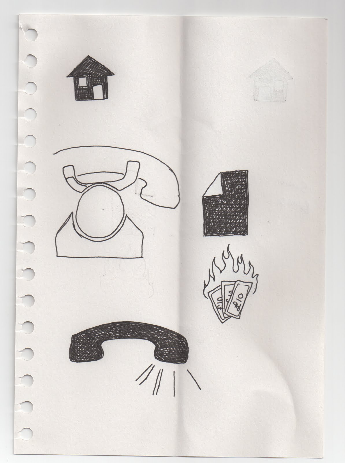
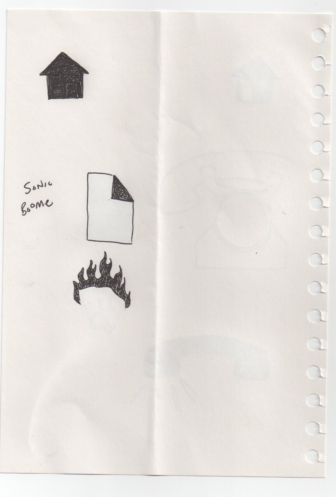
So I'm going for a sketch-pad-esque look, with written writing and trying to continue the work on icons i did last year with icons for the tabs/links instead of words.

we'll see how it goes...